Back to Portfolio

The Choice Podcast.

Conversations that shape how people choose.

Brand identity and website design for a podcast that takes one real decision apart per episode — the pressure around it, the alternatives, and what it cost.

Role UI/UX Designer
Platform Website
Category Podcast / Media Brand
Visit Live Site
The Choice Podcast Website

Most advice skips the hard part.

Most personal-growth content just wants to get you to an answer fast. A five-minute video, a couple of mindset tips, something you can screenshot and move on with. Nobody really sticks around for the part that's actually hard, which is the decision itself.

That's the part The Choice Podcast actually cares about. Two hosts sit down with one guest for an hour and stay on one real choice long enough to get into what led up to it, what else was on the table, and what it actually cost them to go that way.

"Every life is the sum of its decisions."

Advice without the mess

Five-step lists and mindset hacks are everywhere, but they rarely sit with how hard a real decision actually feels.

Formulaic interview shows

Most interview podcasts race through a guest's whole life story in twenty minutes, never staying on one moment long enough to unpack it.

No space for reflection

Feeds are built for quick takes, not the kind of slow, honest conversation a real turning point actually deserves.

One choice. One hour.
No shortcuts.

Each week, two hosts sit down with one guest and pull apart one real decision, instead of skimming a dozen topics for content.

01

One Real Choice

Every episode picks a single decision, not a whole life story, and stays with it until it's actually understood.

02

Unhurried Conversation

An hour, two hosts, one guest, no rigid interview format and no rush to get to the next segment.

03

Something to Sit With

No neat takeaway at the end, just a clearer view of what that choice cost, and what it opened up.

Two hosts, one honest conversation.

The show is led by two hosts who've each lived through the kind of decisions it's built to talk about.

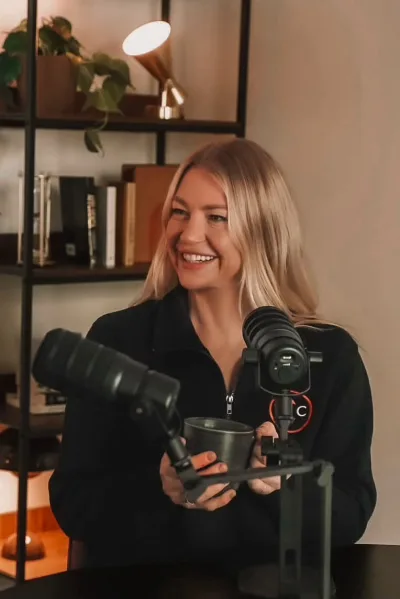
Bianca Criaco

Bianca Criaco

Wellness Educator & Pilates Instructor

Bianca has been through domestic violence, addiction and cancer, and doesn't talk about it like it's some neatly resolved chapter. She teaches now because of it, and that honesty is a big part of why the show works.

Mariah

Mariah

Property Specialist & Psychology Student

Mariah grew up in a high-control religion and didn't leave until she was 30, late enough that it reshapes how you see almost everything. She's studying psychology now, mostly to make sense of her own story first.

A brand built to
turn visitors into listeners.

01

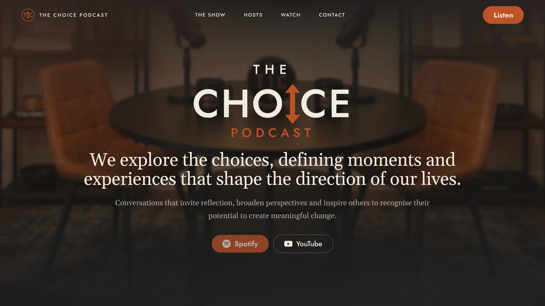
Custom Wordmark & Logomark

The arrow through the "i" in CHOICE was one of the first sketches I did for this project, and it just stuck. Quiet nod to the fork in the road every episode is really about.

Branding
02

Editorial Typography System

Headlines run in a serif with some real weight to it, nav and body copy stay in a plain sans. Reads more like a magazine spread than a landing page, which was the whole point.

Type
03

Warm Cinematic Photography

I leaned into warm, slightly dim studio shots instead of anything polished or corporate. It already tells you what the show sounds like before you've heard a single episode.

Art Direction
04

Persistent Listen CTA

The Listen button follows you down the page. Small thing, but I didn't want it buried somewhere in a footer once someone's actually ready to press play.

Conversion
05

Responsive One-Page Layout

Nothing about the layout changes meaning on mobile, it just narrows. Same order, same pacing, all the way down to a single column.

Website

Designed in Figma,
built with Claude Code.

The visual system was locked in Figma first, then the live site was hand-built end-to-end in Claude Code instead of getting handed off to a separate development cycle.

01

Design in Figma

The wordmark, type pairing, colour system and homepage layout were all finalised in Figma before a line of code was written.

02

Build with Claude Code

The static site was coded section by section in Claude Code, turning the Figma file into real, responsive HTML and CSS in the same sitting as the design decisions.

03

Ship & Refine

Copy, spacing and motion were adjusted straight in code, with changes visible in the browser within seconds instead of waiting on a dev handoff.

Every choice has a reason.

Warm Terracotta Accent
Keeps the site feeling intimate, like the studio conversation it's promoting
Editorial Serif + Quiet Sans
Gives the show a publication feel before a single word of copy is read
Single Listen CTA
Nobody is more than one tap away from actually pressing play
Cinematic Studio Photography
Sets the tone before anyone reads a word of copy

Lessons from branding a voice.

01

Branding a podcast is branding a feeling

There's no product screen to lean on here, so tone, colour, and photography had to do the convincing on their own before anyone ever presses play.

02

One clear action beats many

Cutting the homepage down to a single obvious next step, Listen, made the identity work land immediately instead of getting lost in the navigation.

03

Editorial type builds trust fast

Pairing a confident serif with a quiet sans gave the show a publication feel almost instantly, before a single word of copy was read.

04

Design and build don't have to be separate phases

Building straight in Claude Code right after finalising the Figma file kept small decisions, spacing, wording, hierarchy, consistent instead of drifting during handoff.

Hear the conversation.

The Choice Podcast is live at thechoiceprojects.com, with new episodes releasing weekly.

Visit Live Site

Other projects

Back to All Projects